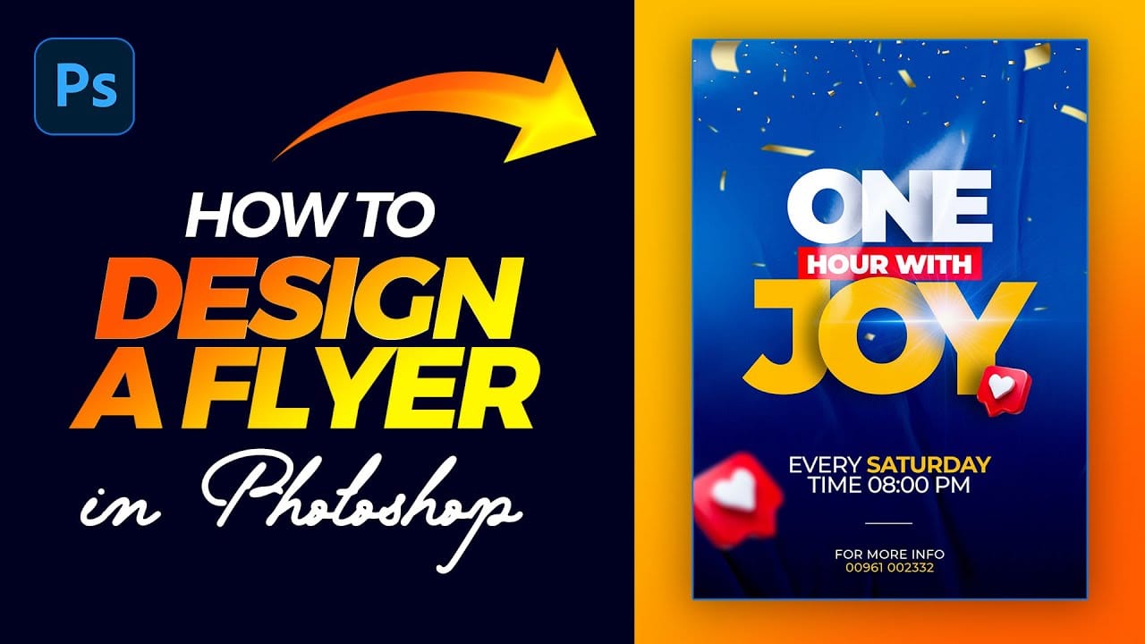
This tutorial provides a straightforward guide to designing a flyer using Adobe Photoshop, perfect for both beginners and those with some experience.
It starts with an introduction to the type tool, allowing you to add and manipulate text for your flyer. You'll set the foreground color to white and choose the Montserrat Black font for a striking appearance. As you work through the tutorial, you'll learn how to duplicate text layers and group them for better organization, ensuring a clean and logical design. The next steps involve adjusting layer styles, such as adding drop shadows and tweaking opacity settings. You'll also create a rectangle beneath your text, adjusting its color to complement your design. The tutorial guides you in scaling text and centering elements to maintain a balanced look.
Moving further, you'll incorporate images and experiment with blending modes and layer masks for creative effects, enhancing the visual appeal of your flyer. With an emphasis on simplicity and clarity, this tutorial ensures that even those with no prior experience can keep up. By the end, you will have a professionally designed flyer, ready to impress.


