Some time ago, I wrote a tutorial demonstrating how to create a papercraft text effect inspired by a design created by Mario Hugo for Wired Magazine.
This time, I've developed another text effect based on papercraft: a pop-up effect similar to those found in children's books. The process is relatively simple. A few gradient layers and the careful bending of shadows are sufficient to create the basic effect of paper-cut words inserted into folded paper.
I hope you enjoy this effect and encourage you to share your results in the comments section below. There's ample room for enhancing this technique by experimenting with paper textures and brushes. Feel free to get creative and make it your own!

Create the Folded Background
Create a new 1000px x 350px document with a white background.
To achieve the open book effect, with a rounded aspect with a center crease, we will have to apply two gradients in two different layers.
1) Download this gradient to your computer.
2) Load the gradient in Photoshop:
To load the gradient in Photoshop, select the GRADIENT TOOL and click on the gradient list pulldown menu at the top of the screen. You will see a small arrow inside a circle pointing to the right. Click on that arrow and select LOAD GRADIENTS.Find your recently downloaded gradient and load it.
3) Create a GRADIENT FILL LAYER right above the BACKGROUND LAYER and select the gradient you’ve just loaded. The image will be filled with the new gradient and the LAYERS PALETTE will have a new layer created with the gradient inside it.
To create a GRADIENT FILL LAYER go to the LAYER’S PALETTE, click on the little small black and white circle (sort of a straighten Ying-Yang design) and select GRADIENT… A small window will open. There you will be able to select the new gradient.
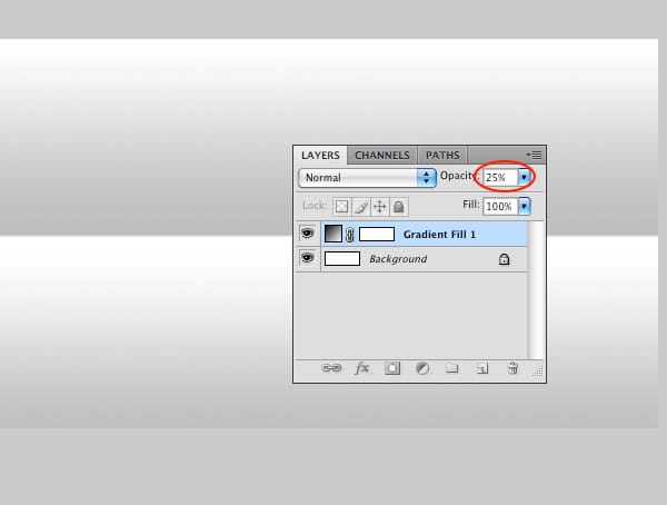
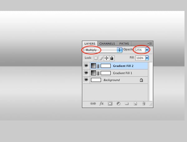
4) Go to the LAYERS PALETTE and select the GRADIENT FILL 1 LAYER change its OPACITY to 25%.
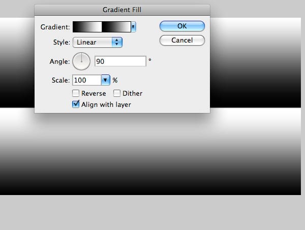
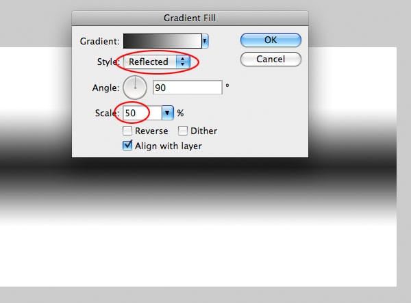
5) Create a new GRADIENT FILL LAYER. Choose the basic black to white gradient and set the style to REFLECTED and click OK.
6) Go to the LAYERS PALETTE and select the GRADIENT FILL 2 LAYER.Set the OPACITY to 25% and the BLENDING MODE to MULTIPLY.
The last step was intended to give a more natural shading to the fold, projecting a bit of shadow to the part of the paper that’s below the fold.
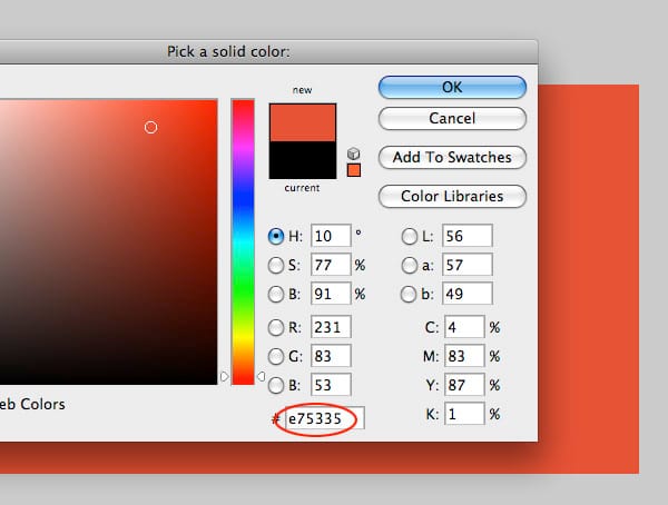
7) Let’s add some color to the background. Create a SOLID COLOR FILL LAYER right above the GRADIENT FILL 2 LAYER. Type E75335 to set the color. The image will be filled with red and the LAYERS PALETTE will have a new layer created named COLOR FILL 1.
To create a SOLID COLOR FILL LAYER go to the LAYER’S PALETTE, click on the little small black and white circle (sort of a straighten Ying-Yang design) and select SOLID COLOR… The COLOR PICKER window will open. There you will be able to select a new color.
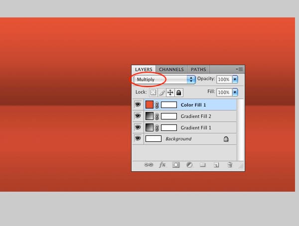
8) Go to the LAYERS PALETTE, select the COLOR FILL 1 LAYER and set the BLENDING MODE to MULTIPL. We’ve just finished the background. In the next steps we will create the text and the shadows.
Prepare the Text
Let’s download Pricedown font and install it.
1) Set the FOREGROUND COLOR to black.
2) Get the TYPE TOOL, set the size to 290px and type the word POPUP in the center of the image.
3) Duplicate the text layer twice by dragging it to the little page icon that’s located at the bottom of the LAYERS PALETTE.
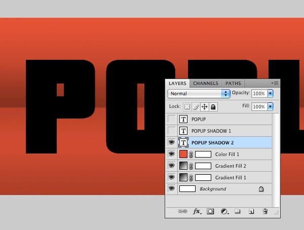
5) Rename the layers as shown on the image below.

6) Hide the POPUP and POPUP SHADOW 1 layers by clicking on the little eye icon at the left of each layer.
7) Select the POPUP SHADOW 2 layer.
8) Go to menu LAYERS > RASTERIZE > TYPE. This will turn this text layer into a bitmap layer.
9) Go to menu FILTER > BLUR > BLUR MORE. Apply this filter twice. This will soften the edges of the letters a little bit.
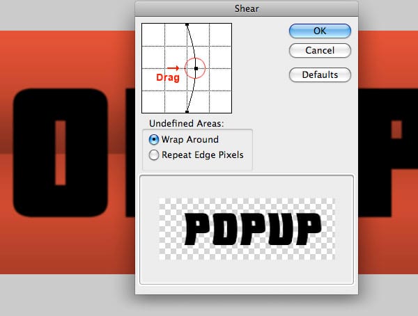
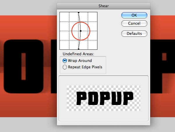
10) Go to menu FILTER > DISTORT > SHEAR…, apply the settings shown in the image below and click OK.:
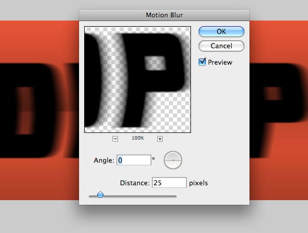
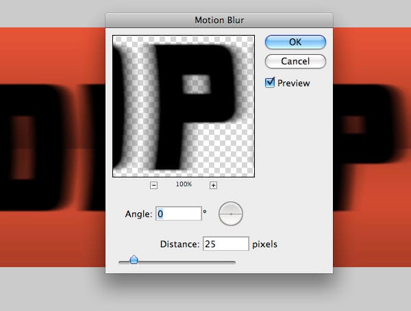
11) Go to menu FILTER > BLUR > MOTION BLUR…, apply the settings shown in the image below and click OK :
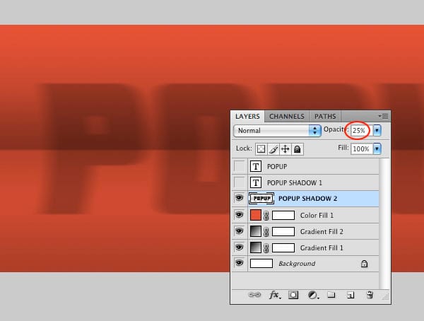
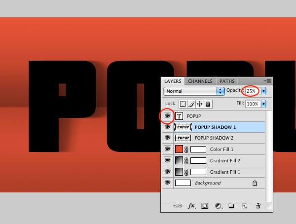
12) Go to the LAYERS PALETTE and set the opacity to 25%
Lets repeat the same process for the second shadow, but this time with less distortion.
13) Activate the POPUT SHADOW 1 layer by clicking on the little eye icon.
14) Select the POPUP SHADOW 1 layer.
15) Go to menu LAYERS > RASTERIZE > TYPE. This will turn this text layer into a bitmap layer.
16) Go to menu FILTER > BLUR > BLUR MORE. Apply this filter twice. This will soften the edges of the letters a little bit.
17) Go to menu FILTER > DISTORT > SHEAR…, apply the settings shown in the image below. This time a smaller distortion than the previous one. Click OK.:
18) Go to menu FILTER > BLUR > MOTION BLUR…, apply the settings shown in the image below and click OK :
19) Go to the LAYERS PALETTE and set the POPUP SHADOW 1 layer opacity to 25%
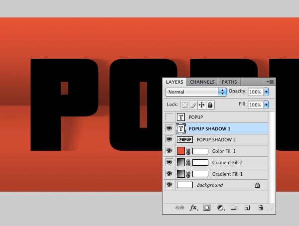
20) Now make the POPUP text layer visible.
20) Select both POPUP SHADOW 1 and 2 layers by clicking on them with the SHIFT key pressed.
21) Select the MOVE tool from the tools palette (or press the letter V from the keyboard). Using the LEFT ARROW key, move both layers to the left so they become aligned with the text. That would be pressing the key about 15 times.
The shadow should be projected to the right of the letters, but a small amount of shadow will show up at the left of the letters. This gives the sensation of a more natural shading (multiple light sources). All in all, it is a matter of faking an effect to make it LOOK real, and not to create a precise render of a scene like those you can get with a 3D rendering software.
Take a look at the position of the shadows.

We are done with the shadows. Now the final stage of this tutorial. Lets give the letters a folded (curved) look with a simple gradient.
21) Go to the LAYERS PALETTE and select the POPUP text layer.
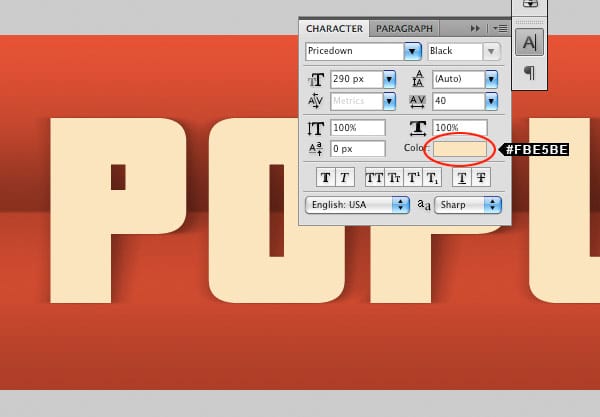
22) Open the CHARACTER PALETTE and set the text color to: #FBE5BE
23) Go to the LAYERS PALETTE, and add a GRADIENT OVERLAY layer style to the POPUP text layer.
To add a GRADIENT OVERLAY layer style to the POPUP text layer, just go the LAYERS PALETTE, select the POPUP text layer and then click on the little FX icon located at the bottom of the palette. A popup menu will show and there you will be able to select the GRADIENT OVERLAY effect.
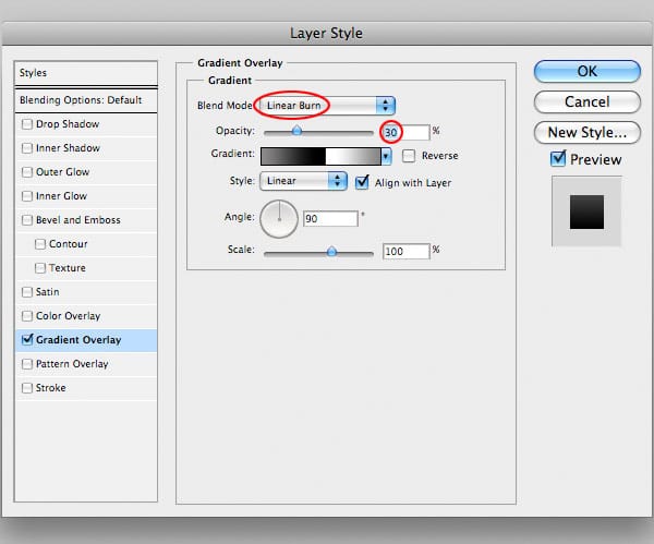
24) Go to the LAYERS PALETTE, and add a GRADIENT OVERLAY layer style to the POPUP text layer. Use the following settings:
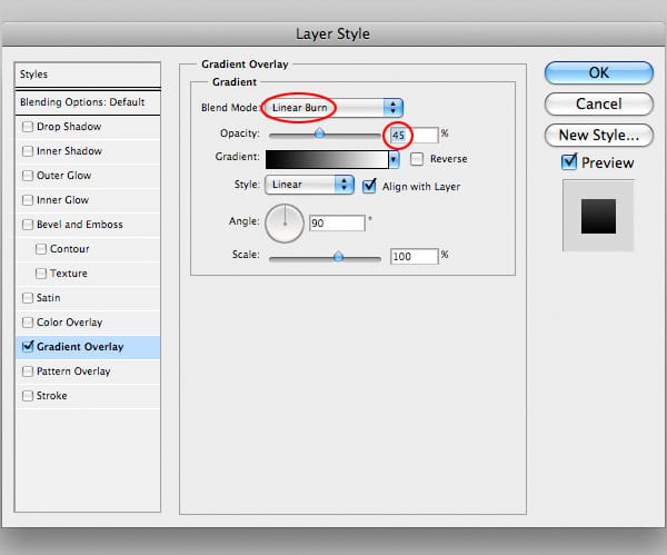
Click OK to close the LAYER STYLES window and we are done!

A different version of this text effect
Although this effect resembles a Popup paper craft effect, it lacks the center fold of the letters. The intention was to create a nice text effect, but if making it closer to reality is a must, then check this variant with a gradient that makes the text look like it was folded.

The only change in this variant is in the gradient we applied to the letters in step 24. This new gradient is a bit more complex than the standard one, but it gives the effect of a folded text. Download this new gradient and apply it to the letters with an OPACITY of 30%.